
My book: Jane Eyre, for which, according to LibraryThing, there are 405 covers. These few I grabbed from Google Images. Can you pick out the "joke" one?
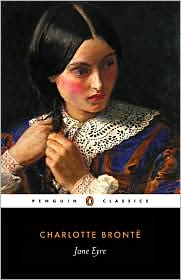
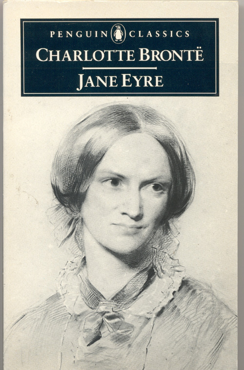
As far as which one is my favorite... I tend to lean toward the more vintage looking ones, just because old books are cool. I like the Penguin Classic one at the bottom, and the old one with the house drawing on it. Which one do you like? Too bad I couldn't put all 405 on here for you to choose from! :)


Um, does the joke cover feature Johnny Cash?
ReplyDeleteThe penguin classics one of the woman braiding her hair is lovely, even if I'm not sure that is how I see Jane. The one with the flowers is kind of weird - I don't see what that one has to do with the book. My copy is the last one with the pencil sketch on the cover. I shall have to go to Library Thing not and check out all 405 covers, as I do love looking at book covers.
ReplyDeleteHi Suey, sorry for picking Wuthering Heights first! Jane Eyre is another good choice though. :)
ReplyDeleteMy copy is plain black, as I've lost the dust jacket, which is neither any of these. But of the lot you posted, I love two of the Penguin Classics.. the third from the top and the third from the bottom. I also like the Everyman Library and the second from the bottom. The flowers are lovely but they're more Sleeping Beauty than Jane Eyre.
I laughed at Sherry's comment about Johnny Cash.. that's the joke cover, right?? :D
Wow, that's a lot of covers! I like the one that looks like a woodcut. Whoa, that one (joke one) looks like it could be a Hardy Boys cover, with that background.
ReplyDeleteI like the one with the roses even though it's so far afield from what you'd expect on a Jane Eyre cover.
ReplyDeleteMy post is here.
what a range of ideas. Some would just have been designed to fit into a publishing series. And some were the cheapest imaginable! The first paperbacks I read didn't have graphics on the covers - I think mainly because they hadn't worked out how to print multicoloured covers that weren't really garish. It also kept printing costs down if you used only one or 2 colours in the printing
ReplyDeleteHi!
ReplyDeleteI just finished this book a few weeks ago. I must have read one of the others because I don't see the cover here. Thanks for stopping by my place. Have a great evening!!
Sherrie
What a fine collection of covers. I like the woodcut and the one with the roses in purple and orange.
ReplyDeleteUm, is it the leering Rochester cover? Yesh! I couldn't look at that one.
ReplyDeleteI was going to do Jane Eyre too but I think you got the cream of the crop here!
I love this. Jane Eyre is my al time favourite reeads. I wished to do this but did not. I too go for vintage covers. I own the last one. And it remains my favourite cover.
ReplyDeleteThe Rochester one is..eeks!
Covered!
I tend to like the classics covers but I also really like the cover with the abstract flowers. It is different and I kind of like it.
ReplyDeleteI thought Chris would do Jane Eyre but it is good to see it done.
ReplyDeleteThe rose cover looks like some publisher had this pretty drawing of flowers laying around and figured Jane Eyre would be good enough of a book to put it on, whether it had anything to do with the book or not.
My cover is the 2nd last one, quite hideous, but it was a cheap book. There is a gorgeous book at the library that I'd like to 'borrow' and then have to replace.
I also contemplated doing that for the library book The Gun Seller which was autographed by Hugh Laurie on the inside. But I didn't.
My favorite is the 5th one. Probably because that's the one I've read. They are all nice. Except for the learing johnny cash lookalike one.
ReplyDeleteGood job.
Mine is finally up now.
Happy Reading
I love the signet classic and the penguin classic ones towards the bottom of the post. You sure found a wide variety. The "johnny cash" cover cracked me up--truly hideous. What a great book to choose to do this with!
ReplyDelete*smiles*
Kim
This is my favorite book! The copy I own is that last Penguin version, but out of all of these covers, I like the one that was done with wood engraving.
ReplyDeleteI like the Everyman edition (I think) with the gray dress. Honestly tho, I'd totally buy the "johnny cash" one.
ReplyDeleteGreat collection and a wonderful classic :)
ReplyDeleteI think no five is my favourite because of the Victorian interior.
Have I ever mentioned that Jane Eyre is my all-time favorite book? I love that you chose it to expose the covers...there's quite a wide array there! I'm with the rest of your commenters: the Johnny Cash leering at the 80's model is the creepiest cover for Jane Eyre! Whew!
ReplyDeleteWhat a great assortment of images. I can't possibly pick a favorite. Nice post!
ReplyDeleteah, one of my all time favorite books!
ReplyDeleteI like the orange and white penguin cover...just because that cover is a classic all by itself!
ReplyDeleteThere are so many!! I think they are all pretty!
ReplyDeletePlease tell me the joke cover is the ninth one!
ReplyDeleteWow, 405 covers!!! That's astonishing. I used to have one that had some lovely woodcuts inside, on the frontispiece I think.
I like the fifth one - a distant Jane in the other room. It looks elegant.
I like the 8th one down. Something about how bright it was.
ReplyDeleteThis is too tough because when the book describes her as unattractive we all want to know HOW not pretty she is and a cover with an even moderately pretty girl on the cover just messes things up. The last two covers show two truly forlorn looking girls and so they might work. My cover is the Signet Classic and I never liked that cover. I like the one next to it, the Penguin, and also the other with the really dark background because they can serve to make the mood dark enough without looking sloppy.
ReplyDeleteI love the plain orange Penguin version. And the artsy flowers.
ReplyDelete